Friday, 10 May 2013
Thursday, 9 May 2013

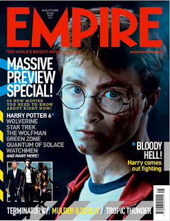
Chosen photograph for film magazine cover


Tuesday, 30 April 2013
Monday, 29 April 2013
Progression of film magazine cover


Thursday, 25 April 2013
Wednesday, 24 April 2013


Changes made after first draft of the trailer
- Added a soundtrack.
- Faster pace of editing at the end.
- Flash shot at the end with the character Emily.
- Cut instead of a fade transition on shot 9.
- swapped shots 32 and 34 around and corrected a few shots.
- Added a few flash shots at the end to create a sense of fear.
- Put in a tracking shot of boots walking towards the camera to build up suspense.
Tuesday, 23 April 2013

Sunday, 21 April 2013
Film Magazines research
I have been looking at hard copies of film magazines to have a good look at the layouts which different magazines use, this will help me once creating my film magazine as I can base my ideas from professional magazines and have an idea of what I think looks effective on a front cover.
 I
IReflection from the focus group
As a group, we conducted the focus group on Thursday from 1:30pm-2:10pm, I think that it was a great success, the group have us important information about our trailer, and our individual tasks which would help us improve them. Not only were they giving feedback, but they were also praising our productions, this has gave me personally a big confidence boost into making my film magazine. The group agreed with the genre of the film and also gathered what the average target audience would be. We gathered our information by documenting the session (which I will upload soon) with a film camera, we also handed out a questionnaire for the film trailer to get some written feedback. The groups opinion on who the killer was mixed, the red herring which we had put into the trailer had worked as none of them guessed that Emily was the killer, all of the people in our focus group said that they would go and watch this film in the cinema due to its storyline. I will be posting the video response with an evaluation soon of the film promotional package soon.
Script which we used for the focus group
Introduction
Hi, we are part of a media group which have created a film trailer, we would like you to view the trailer and answer the following questions based on what you have watched.
View trailer and answer questionnaire
|
So basically our trailer is supposed to the obsessive relationship that the sister has over her brother. Her brother is the heroic figure to her as she was physically abused by her drunken father when she was younger and her safety was found in the game ‘Hide and Seek’ where she would be able to hide away from her father and her brother would save her after. She is jealous of the relationship between her brother and his girlfriend, which unknowingly triggers a psychotic side to her. When their mum goes away for the weekend Jack invites his friends over and Emily suggests playing hide and seek again which they agree too as a laugh, her psychotic side comes out and she unintentionally attacks and torments his friends who are unaware that it is her doing it.
Open Discussion
1. Can you identify the protagonist/ villain? And what clues are given?
2. What would predict the story of the film is based on the evidence given in the trailer?
3. What were the 3 main images that stood out for you?
4. Would you go and see this film in the cinema?
View film posters
|
Ok now we would like you to look at 3 film posters and film magazine covers that we have individually produced to promote our film trailer.
1. Which do you think is the most successful to promote our film trailer? Why?
2. What are your thoughts of the main images?
3. What is the most memorable part on each poster?
4. Do you think that any of the posters give too much of the storyline away?
Now we will show you our individual film magazine cover…
View film mag covers
|
1. Do you think that each film cover looks like a legitimate film cover?
2. Does the colour scheme work for each cover?
3. Does the main image present the main actor/actress well?
4. What do you think of the layout for each film cover?
Finally we would like to leave an open floor for any other honest comments you would like to add that have not been answered in the questionnaire?
THANK YOU
Film Questionnaire for focus group
Please circle one answer, unless asked otherwise
|
1. What does this trailer predominantly target?
Male Female Both
What attracts your chosen gender?
_______________________________________________________________________________________________________________________________________________________________________________________________________________
2. What age range would you say the target audience is?
12-15 15-25 30-50 50+
Why?
__________________________________________________________________________________________________________________________________________
3. What genre do you believe the trailer is?
Horror
Sci-fi
Psychological Thriller
Comedy
Action
Why?
__________________________________________________________________________________________________________________________________________
4. List 3 main images that stood out for you and why?
·
·
·
_____________________________________________________________________________________________________________________________________________________________________________________________
5. Can you identify the protagonist/ Villain, what clues help you?
____________________________________________________________________________________________________________________________________________________________________________________________________________________________________________________________________________________
6. Do you think the soundtrack compliments the trailer? If not why? If so how?
____________________________________________________________________________________________________________________________________________________________________________________________________________________________________________________________________________________
7. What would you predict the story of the film is based on evidence given in the trailer?
______________________________________________________________________________________________________________________________________________________________________________________________________________________________________________________________________________________________________________________________________________________________________________________________________________________________
8. Would you go and watch it in the cinema? And why?
Yes No
__________________________________________________________________________________________________________________________________________
THANK YOU!
Friday, 19 April 2013
Results from questionnaires
I have created a questionnaire based on the ideas for a film magazine and have handed it out to nine members of my focus group to ask what they would like and would they think would make a good film magazine. I am going to consider their responses whilst creating my magazine front cover as I will have an idea of what my target audience want to see/read.
The first question I asked on my questionnaire was “What age group are you in ….” I had six responses saying that they were aged between 18-21, two responses saying they were aged between 16-17, no responses from anyone aged 11-15 or 27+ and one aged 22-26, this suggested to me that I would be aiming my magazine at young adults between the age range of 16-26, just like my film trailer.
The second question which I asked on my questionnaire was “Which gender are you?”, I asked this question to make sure I realised what the males wanted on a magazine and what the females want on a magazine, but from the results of the questionnaire, it seems they have very similar opinions. I had six responses from males and three responses saying that they were female.
The third question which I asked on my questionnaire was 'Which of the following articles would you be more interested in reading? (tick two)' I had 5 responses saying that they would be interested in Reading film reviews, I had three responses for actor interviews and tickets to an opening premiere. I had two responses for the latest films released and behind the scenes shots/interviews and one response for a look at the latest award winning films.
The fourth question which I asked on my questionnaire was 'Which title for the magazine (masthead) do you prefer?' I had mixed responses from this question, mainly from only two options, Motion had four responses and Spotlight had three responses, some of the people attending the focus group also recommended some of their own for me, for example Action and Spotlight. I will not consider which masthead I will use for my film magazine.Screen, Audition and broadcast had no responses.
The fifth question which I asked on my questionnaire was 'Which slogan do you prefer?' I had a lot of responses for Lights, Camera.. Action at six responses, getting behind the scenes had two responses and the film guidebook had one response. Get all the latest film info had no responses.
The sixth question which I asked on my questionnaire was 'Which colours should the magazine be? (choose three)' White and black were very popular responses having nine votes each, so everyone voted white and black as 2/3 main colours to be used. Red had six responses and blue had two responses, one of the participants in this questionnaire also came up with an answer for me, they came up with the colour yellow to be used, I will consider their responses once creating my film magazine.
The seventh question which I asked on my questionnaire was 'Would you buy a film magazine?' I had 7 responses saying yes that they would buy a film magazine, and for those who said that they wouldn't buy the film magazine, I asked them why on the question, both responses stated that they wouldn't buy the magazine as it is only based on one subject and they prefer to read something which gives information about a variety of subjects.
The eighth question which I asked on my questionnaire was 'How much would you pay for a film magazine?' I had mixed responses from this question which I asked, a majority of options were chosen. two people said they would pay between £1.00-£1.50 for a film magazine, three people said that they would pay between £1.50-£2.00 and £2.00-£2.50 for a film magazine, one person said they would pay between £2.50-£3.00 and nobody said they would pay more than £4.00
The ninth question which I asked on my questionnaire was 'What would you prefer to see on the front cover?' The most popular response was that they wanted to see the character which they re playing in a hit movie (for example Emily from my film), that had 7 responses and there wasn't many people who would prefer to see the actor themselves in smart attire as there was only 2 responses for that option.
Overall this questionnaire has helped me come to important decisions which my magazine will have. I have no got ideas on what my target audience like and dislike, I have took in their opinions and will consider them whilst making decisions for my film magazine, for example with the masthead, over the next two days I will make a decision weather to use the masthead Motion or Spotlight. Every single question has helped me gather information which is key to creating a successful film magazine. I am now going to look at more professional magazines and think of which codes and conventions I can display in my own film magazine.
Thursday, 18 April 2013
Focus Group Questionnaires
The focus group was a success, as a group, we will be uploading the video of it at a later date. But i have also got the results of my questionnaire. I will be uploading the results at a later date, but here is evidence of them filled out.


Group Discussion
This was supposed to be uploaded in October when it took place, but I have had trouble uploading this video which is why it is on here late, I have also had problems with uploading my 2 other trailers analyses off of slideshare, I will be posting these on here soon.
In this discussion which took place, we all discussed our ideas individually and were trying to blend them together to create a good film plot.
The idea which Lucy had was based on a psychological thriller, where a group of teenagers became trapped in a mental institution, the teenagers were trapped and were being killed off one-by-one, this was until the final main character had come to the conclusion and realization that they had become mentally ill/unstable. This did sound like a very effective idea, but considerations had to be made on where we could film the trailer, as well as props which we could use, due to lack of budget, we wouldn't be able to buy props for a location which would make it look like an old mental institution e.g. beds, wards etc.
Lauren's idea was of a group of teenagers which had gone camping, but did not realize that a curse lurked within the woods. The curse was left there from a little psychotic girl who murdered her own family there. It is said that she still haunts the woods looking for new victims. The characters in the film each get killed off one-by-one until there are 2 characters left, the twist in this plot is that they then get arrested by the police as murders and once they try to explain what had happened, they get treated as being mentally ill and are sectioned to a mental institution. There are limitations to this plot, the props could be an issue, e.g. police car, police uniform etc, also this is not a very original plot as this type of plot is very stereotypical for a psychological thriller.
My idea was a psychological thriller. The main personality which is key to the plot was a brother who suffers from schizophrenia who enjoys playing hide and seek with his little sister. The plot takes place in one night, this night, they order a take away whilst their parents are out, but the delivery man also suffers from schizophrenia and sneaks into the house and begins to have a mental breakdown. Whilst the brother and sister are playing hide and seek, he joins in without them knowing, but is playing a twisted version in his mind by seeking for them both to kill them. A chase encounters throughout the house. The ending is that after killing off both the brother and the sister. The delivery man realizes its his schizophrenia that is making him act the way he is, he gets put into a mental institution for life. There are many limitations to this plot as we don't have any actors which would fit the age of these characters.
We concluded that we were not going to use completely one persons idea, we have come to the decision of incorporating each others plots to create one plot., we are going to be using Lauren's idea of locating the film in the woods as it is easily accessible at any time. We decided to go with the idea of having a group of girls but one of the females in the group suffering from an undiagnosed case of schizophrenia. She flips out by attacking her friends, but her friends just presume she has a 'short fuse'.
Film Magazine Questionnaire
I have created a questionnaire which I will use in the focus group to gain feedback on what my target audience would be interested in, this will help in the development of my film magazine. I will be posting the results after they have been filled in.
1. What age group are you in?
- 11-15
- 16-17
- 18-21
- 22-26
- 27+
- Male
- Female
- Actor Interviews
- Tickets to a premiere opening competition
- Latest films
- Free Posters
- Film Reviews
- Latest Award Winning films
- Behind the scenes
- Motion
- Spotlight
- Screen
- Audition
- Broadcast
- ________________________________ (state your own)
- Lights, camera.. action
- Get all the latest film info
- Getting behind the scenes..
- The film guidebook
- _______________________ (state your own)
- White
- Black
- Red
- Blue
- Other (please state)
- Yes
- No (please state why)
- £1.00-£1.50
- £1.50-£2.00
- £2.00 - £2.50
- £2.50 - £3.00
- £3.00 - £4.00
- £4.00 or more
- The actor themselves (smart attire)
- The character which they're playing in a hit movie (e.g. Emily)
- Other (please state)
Focus Group
We have arranged for people 9 people to feedback on our film promotional package. I have also created a questionnaire for the audience so I can gather information on what ideas would work best for my film magazine.
Focus Group
As a group, we are doing a focus group for feedback on the 18th of April at Lunchtime.
We have created a script which contains open questions and questions for the audience which will enhance our feedback.
We have created a script which contains open questions and questions for the audience which will enhance our feedback.
Sunday, 14 April 2013
Analysis of My Movie Poster

The film title of this film which is being advertised is 'Deprived'. This film title suggests that somebody has been deprived of something, it is suggested from the image that the shadow is the one being deprived.
The main image is of an eye which is looking terrified with a shadowed figure inside the pupil of the eye. This can give two different stories, it can seem that there is a reflection of the figure on the eye, or it can seem that there is someone trying to plead out for help from inside the eye. These two interpretations of this picture can spin off ideas of two different plots.
The image is a multi-layered image and raises questions about the plot of the film, weather it may be the person who's eye it is which is unstable with a split personality, or it may be them being frightened for their life by looking at someone else, this creates a code of enigma as we don't know who/what the figure represents. The film stars are Lucy Shaw and Garin Price, their names are not very prominent on the poster, but this may be because they are not very well known actors which is conventional for a psychological thriller.
The film poster does employ iconography of a psychological thriller with the main image being the eye, it makes the audience wonder weather the problem with this shadowed figure is inside their head, or weather they are seeing this shadowed figure first hand, the colors also employ iconography, as white and red are commonly used colors for text on a psychological film poster, the red writing usually represents fear and/or blood.
There are no main actors shown evidently, as we as an audience cannot identify who the shadowed figure is, and we have no idea who's eye it is, we presume it's a female's eye as the actor has eye-make up on. But from the image we can tell that the eye looks frightened, due to the size of the pupil. This can be seen in a positive way, as it gives no clues away to who is going to be behind the attacks which take place in the film.
The film poster does carry a movie tag-line, this is 'You can run, but you can't hide', this is usually linked to the childhood game of hide and seek, this could bring brief explanation to the image, she could be the one hiding, or the shadowed image could be the person looking for 'her'. This could also have another meaning of how there will be no escape for the victims in this film.
The films credits are carried in the billing block which is conventionally based at the bottom of the film poster, the producers and directors are not very well known, this may be why their names are not bigger on the poster and left in the billing block. The credits also has a website where the audience can get more information about the film and maybe extras, this website is 'www.DeprivedFilm.com'. This could maybe be a hint that the producers are aiming their film at technophiles which are usually a younger target audience, as they are offering them to look up the trailer online for further information.
The films USP is the there are no poplar actors, this goes with the codes and conventions of a psychological thriller, as no acting personalities can be shown, this will make the films story-line less predictable. Another USP is that we cannot identify who the killer is in this picture, this creates a code of enigma and may help sell the film as 'gossip' could be formed online as people may be discussing who they think the killer could be.
Tuesday, 26 March 2013
Progression of poster
I have added more company names down the bottom of the poster as I believe it makes the poster look more professional, I have also made another version with a different layout, I have also changed the font for the date which I have used. I have changed it to a more scratchy-looking title, this gives the poster a rough edge which will grab the audiences attention. I am going to ask around on which layout people believes looks more professional, I will consider other peoples opinions to improve my poster.


Monday, 25 March 2013
Progression of poster
I have changed the film title on my film poster. I decided to make this change as the title font I have now is the on we have used in the trailer, I have done this as it is conventional to use the same title on the film poster as the one used in the trailer/film. I have changed the size of the billing block as on my previous draft I thought that it took up too much of the page. I have also added the copyright logo on the bottom of the page.
I am also am considering changing the font which I have used for the date of release. I am also going to add the production logo into the bottom left of the poster, after this I am also going to create some more production company logos to fill up the bottom of the poster to make it look more professional. Any more changes which I will consider doing/carry out I will post on here.

Thursday, 21 March 2013
Removed background on created copyright logo
I have removed the background on my copyright logo ready for my next session editing my film poster so then I can go straight into editing/adding pieces to my poster to make it look more professional. I removed the background on photoshop using the 'background eraser' tool. It worked around the black edges and left the logo on there ready to drag straight into my film poster in my next editing session through adobe bridge, here it is:


Copyright Logo to add to film poster
I have created a copyright logo to go onto my film poster on paint.
Here is an original copyright logo which I found online:


Here is an original copyright logo which I found online:

Here is the one that I have made on paint:
I have put it on a black background so that I can remove the background and place it onto my film poster easily on Photoshop with the 'background eraser' tool.
Plan for the next hour editing my film poster
Below is a list of things I am hoping to achieve in the next hour session of editing my film poster:
- Place a copyright logo at the bottom of the page to give it a professional edge.
- Make the billing block smaller as I believe it takes up too much of the page as I want the main focus to be of the main image.
- Maybe change the font of the website as I believe I can make it look more professional if I use a different font.
- Maybe changing the font of the film title to the one which we have used in the trailer as a group, I am considering doing this as most big films stick to one recognisable font. I also believe that my current font may seem to look more of a graffiti style instead of a scratchy style, I may ask a few people in my target audience their views on it before I change it.
- Maybe add a Unique Selling Point (USP) to the poster, this may just be the directors name on the poster or the main actor/actors as not a lot is given away with the image of an eye.
Third Hour of Editing Film Poster
I have completed my third hour editing my poster, I still think that I am incomplete as I feel I need to sharpen the edges on the background image within the pupil. and I also am going to add a 'Copyright' logo which I will make on paint and publish on here at a later date to make it look more professional, I am also going to ask some people in my target audience for points to improve my poster.

Wednesday, 20 March 2013
Film Magazine research
I have recently thought about how I am going to make my film magazine after I am finished with finalising my film poster, I have done some research and found some Film Magazines I like, I will be doing further analysis on some of these film magazines at a later date. Here are some Film Magazines I found online which I like the look of, layout-wise and image-wise:


Subscribe to:
Comments (Atom)